Balance in Art – How Artists Achieve Visual Equilibrium
This post may contain affiliate links. We may earn a small commission from purchases made through them, at no additional cost to you.
What is balance in art and how is it applied? What is the difference between symmetrical balance and asymmetrical balance in art? As one of the principles of art, with the correct use of balance, artworks appear more visually stable. Let us learn more about this concept by exploring balance in art examples and a deeper explanation of how it is effectively used by artists.
What Is Balance in Art Used For?
The application of various art elements such as texture, line, form, and color in the production of artwork in a manner that provides visual stability is referred to as balance in art. Balance, together with proportion, unity, emphasis, and rhythm, is one of the principles of art used to organize an artwork’s structural elements. In general terms, balance pertains to the equilibrium of various elements. In art, though, balance may not always mean a full visual or even physical balance of elements around a central point of the composition, instead referring to a configuration of forms that evokes a perception of balance in onlookers.
 Checkerboard and Playing Cards by Juan Gris (1915); Juan Gris, Public domain, via Wikimedia Commons
In art, the balance of the various parts is accomplished by the unification of opposite forces. Balance is one of the essential building elements of visual imagery and adds to their aesthetic power. Balance may be divided into several categories.
How We Perceive Balance in Art
To appreciate the significance of balance in art, we must apply the same logic that we use when seeing a three-dimensional object. A three-dimensional structure that is not properly balanced will most likely topple over. When painting two-dimensional images on a flat surface, we must rely on our own perception of dimension and balance. We must employ the same analogy as with the actual object, but with one exception. Although three-dimensional items are easily assessed for balance because they occupy the same plane as us, the sensation of balance in contemporary art, particularly art produced on flat surfaces, stems from a mix of color, line, and shape.
If we analyze the balance of physical items according to the distribution of their mass, the same pertains to art, only that the weight distribution is now visual rather than physical.
 View of Houses in Delft or The Little Street by Johannes Vermeer (between c. 1657 and 1658); Johannes Vermeer, Public domain, via Wikimedia Commons
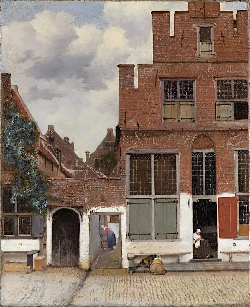
When establishing balance in two-dimensional artworks, designers and artists must exercise caution in distributing weight to the different components in their artwork, as too much focus on one aspect, or a collection of them can draw viewers’ attention to that element alone while leaving others unacknowledged. For example, X-ray images of Johannes Vermeer’s painting The Little Street, revealed that he originally placed a standing female figure to the right of the alleyway, but removed her when she disturbed the balance of the composition. Regardless of the medium, balance is vital because it adds visual rhythm, harmony, and coherence to artwork and affirms its wholeness.
The Types of Balance in Art
The principle of art known as balance, can be grouped into several types. The most commonly used types are symmetrical, asymmetrical, and radial balance. For this article, we will focus on this principle of art’s significance by looking at balance in art examples drawn mostly from modern and contemporary art.
Symmetrical Balance in Art
Symmetrical balance is established by assigning equal weight to components throughout the composition’s central point. This center point could be vertical, horizontal, or diagonal. This results in a mirrored or repeated image that will appear to be perfectly balanced. Symmetry is intrinsically appealing—we’re hard-wired to like facial symmetry, for instance. Whether that’s because evolutionary theory tells us to search for a healthy partner, or just because we prefer to establish order in a mostly disorganized and unpredictable environment, it’s apparent that symmetrical imagery is more appealing to the human eye.
While symmetrical balance is appealing and desired, it is also ubiquitous in visual culture, which means that symmetrical pictures may take on the visual equivalent of white noise. Consider adding a distinctive feature to an otherwise symmetrical artwork, such as a contrasting hue on one side of the design. This will keep the audience’s attention engaged and the image interesting.
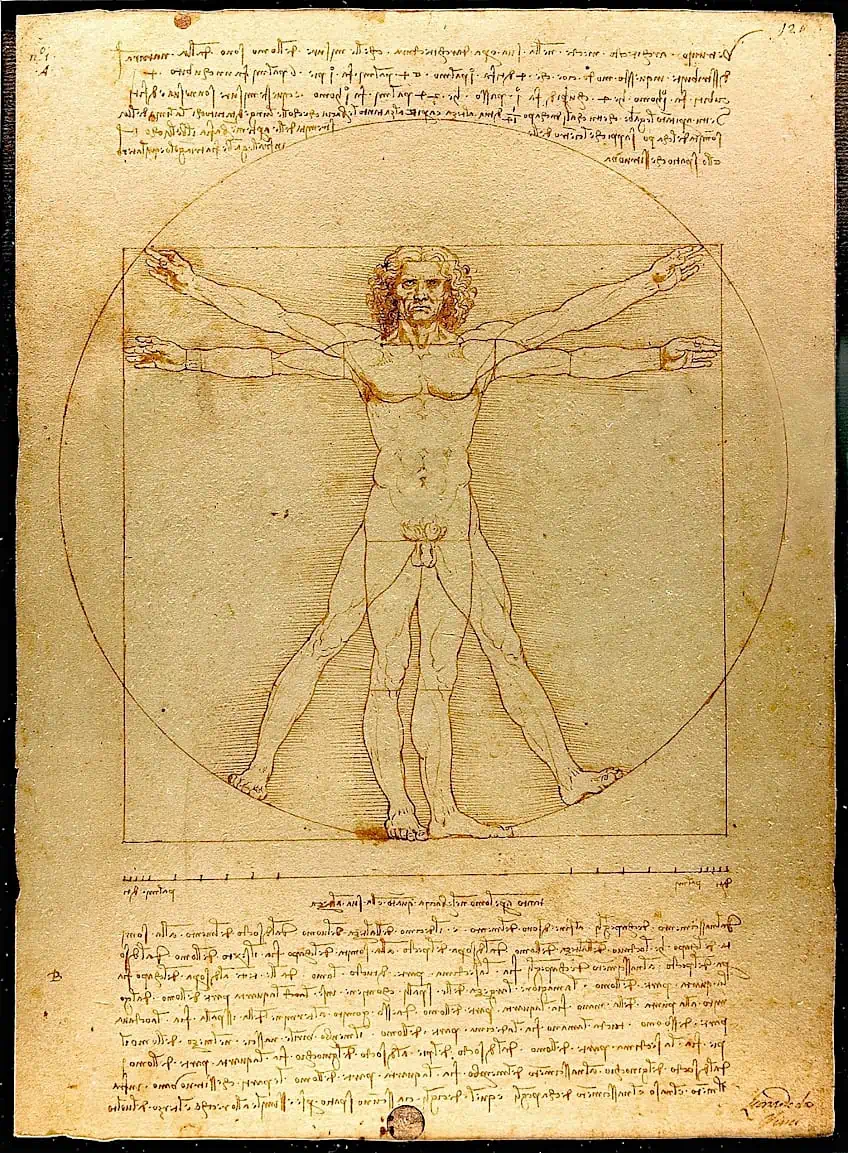 Vitruvian Man by Leonardo da Vinci (c. 1492); Leonardo da Vinci, Public domain, via Wikimedia Commons
Leonardo da Vinci’s The Vitruvian Man (1490) is an illustration of an artwork that effectively employs symmetrical balance. The man’s body is centered in the image, and his legs and arms are uniformly stretched in all directions. The surrounding square and circle are likewise perfectly symmetrical. This artwork’s use of symmetrical balance provides a sense of harmony and solidity. The figure seems well-balanced and in command of his environment. The mathematical correctness of the design, which represents da Vinci’s concern with the link between science and art, reinforces this impression of symmetry.
Asymmetrical Balance in Art
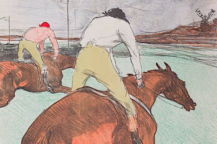
Asymmetrical balance occurs when the various features of a design are different yet seem balanced because they are equally weighted. There might be two primary components of identical weight but different forms, or one bigger, heavier component balanced by two smaller focus points. Asymmetrical balance, particularly in comparison to symmetry, can generate images with varied degrees of beauty, but they typically produce more intriguing dynamic imagery. In comparison to symmetry, perfecting asymmetrical balance takes a bit more experimentation and experience. The end effect, though, can be imagery that feels very contemporary, vibrant, and captivating.
 The Jockey by Henri de Toulouse-Lautrec (1899); Henri de Toulouse-Lautrec, Public domain, via Wikimedia Commons
Asymmetry corresponds more to the off-kilter energy of the 1960s than the comforting precision of the 1950s. Both decades possess distinctive design qualities, but visuals that feel a little out of the ordinary are more engaging and invigorating. Being adventurous and creative with the color, scale, and form of objects in the design is essential for achieving asymmetrical balance. Because the visual isn’t symmetrical, the goal is to keep the eye focused while yet encouraging an overall feeling of balance. If two pieces are overly similar, they risk being perceived as a poorly performed rendition of symmetrical balance.
For strong contrast, try scaling up one element while drastically reducing others, or utilizing brighter colors on small elements to make it feel equally balanced with bigger, duller parts. The distance can also help to promote asymmetric balance. A substantial, heavier feature that appears to be a bit farther away from a smaller, light component, will give the whole image a sense of completeness. The distance keeps the smaller element from becoming overpowered, resulting in a lively and balanced design.
The Great Wave off Kanagawa (1831) by Katsushika Hokusai is an example of asymmetrical balance in action. The composition of this woodblock print is not completely symmetrical, but instead generates a dramatic tension between the components. With its forceful diagonal lines and rising form, the enormous wave in the front dominates the composition, whereas Mount Fuji in the backdrop provides a counterweight with its more fixed and steady form. The uneven balance conveys movement and intensity, as though the observer is being drawn into the breaking waves. At the same time, despite the chaotic subject matter, the equilibrium between the wave and Mount Fuji gives the arrangement a feeling of harmony and stability.
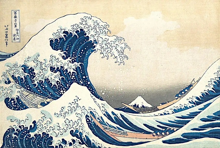 The Great Wave off Kanagawa by Katsushika Hokusai (1831); Katsushika Hokusai, Public domain, via Wikimedia Commons
Radial Balance in Art
Rippling water, the insides of shells, and sunshine beams all have a mesmerizing, relaxing effect. Radial balance is used in these artworks to direct the viewer’s attention to a primary focal point. Elements radiate evenly from the middle, resulting in a balanced, relaxing design. Tree rings, whirlpools, and flower petals are all manifestations of this lovely type of balance that happens naturally in the environment.
Spirals are the easiest approach to establishing radial equilibrium in graphic design, and they may also be used to direct the eye’s attention to the focal point of the artwork.
For example, to direct the attention of the customers to a deal or event, marketing flyers, and event banners often incorporate radial balance into their designs. Close-up photos of flowers and plants in photography frequently reveal an inherent radial equilibrium, producing tranquil and naturally appealing photographs. Illustrators can produce their own spiral images that exhibit radial balance, with cyclical optical illusions increasing the mesmerizing effects.
 Tibetan monks creating a Green Tara Sacred Sand Mandala in 2017; Festival of Faiths from Louisville, United States, CC BY 2.0, via Wikimedia Commons
The Mandala, a spiritual symbol in a few Eastern religions, is an example of an artwork that successfully incorporates radial balance in art. The composition of a mandala is structured in a circular fashion, with repeating parts spreading out from a center point. Each element of the design is generally exceedingly symmetrical, replicating the others around the focal point. The use of radial balancing in a mandala creates an impression of balance and harmony, with repeating parts and symmetrical design providing a feeling of cohesiveness and wholeness. The viewer’s gaze is directed to the composition’s middle, where the most vital elements are typically positioned.
Crystallographic Balance in Art
Giving all of the elements equal weight results in crystallographic balance. Instead of a precisely symmetrical design, the outcome is a kind of balanced disorder in which many components come together to form a cohesive whole. The spectator is persuaded that a crystallographic image is harmonious even if there may be many different and irregular elements since the eye cannot focus on a particular area of the image. By overloading the design with diverse elements, you can establish a kind of mosaic equilibrium in your artwork. Minimalist layouts will enable the eye to identify specific elements, reducing the effect. One could also try experimenting with size and proportion.
 The Resurrection of the Dead and Doomed Lead into Hell (fragment of a Last Judgement) by a follower of Hieronymus Bosch (between 1500 and 1525); Follower of Hieronymus Bosch, Public domain, via Wikimedia Commons
When integrated into a complex mosaic arrangement, slightly bigger pieces won’t overpower the smaller ones. In reality, a disordered arrangement of irregularly sized parts might make the image appear more appealing and organic. You could also pick a color scheme that is comparable or complementary to make the various elements feel more balanced. An example of crystallographic balance in art would include the paintings of Jackson Pollock, the famous Abstract Expressionist.
Among many others, his artwork Fall Rhythm: Number 30 (1950) illustrates his signature action painting approach of a variety of pigments splashed and thrown across the canvas. When we look at Pollock’s works, our eyes are drawn to the whole area, which is overflowing with color and lines. Despite the fact that his art is chaotic and varied, the overall impact is of a peaceful and homogeneous wholeness. To generate a crystallographic effect, use distinct or similar components and then duplicate them. Because these images are typically viewed as background noise by the eye, they function well as backdrops and backgrounds for more significant visuals or text. There is no obvious focal point, and the apparent chaos of his works generates a balanced effect.
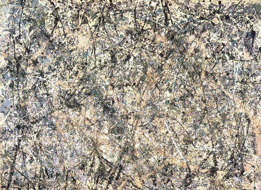
Number One (Lavender Mist) by Jackson Pollock (1950); Jackson Pollock, CC BY-SA 4.0, via Wikimedia Commons
The Seven Principles of Art Overview
- Principles of Art Overview
- Movement in Art
- Contrast in Art
- Pattern in Art
- Unity and Variety in Art
- Emphasis in Art
- Proportion and Scale in Art
That covers our look at one of the principles of art required to make a well-rounded artwork. Balance in art involves the arrangement of components in such a manner that the observer obtains a sense of equilibrium from the artwork. Yet, while creating sculptures, both their visual and physical weight is regarded in order to achieve a sense of balance. When people speak of balance in art, they are referring to the use of creative elements in the creation of an artwork that generates visual stability. It is essential to achieve balance in art so that one side of the artwork does not appear heavier or lighter than the other side. By properly applying balance, the artwork will look more coherent, stable, and aesthetically pleasing to your viewers.
Frequently Asked Questions
What Is Balance in Art and What Are the Various Types?
Just as an object in real life needs to be balanced so that it does not fall down, any artwork similarly needs to convey a sense of balance. Without the weight associated with physical artworks like sculptures, we need to find other ways of weighing up the various elements in a visual artwork. There are also various types of balance that one can apply to one’s art, such as symmetrical balance, crystallographic balance, radial balance, and asymmetrical balance in art. With the correct use of balance, artworks like yours will begin to look more professional in no time.
What Is Asymmetrical Balance in Art?
Asymmetrical balance is a sort of visual balance in art in which the composition’s parts are not distributed equally on both sides of a central axis. The artwork is balanced without relying on symmetry. Asymmetrical balance emphasizes the visual weight of the pieces instead of their real dimensions or form. This indicates that if a little object on one side of the design has greater visual weight, it can balance off a bigger object on the opposite side. When the eye is attracted to the parts that are not properly distributed, asymmetrical balance can generate a feeling of motion, energy, or intrigue in the artwork.

In 2005, Charlene completed her wellness degrees in therapeutic aromatherapy and reflexology at the International School of Reflexology and Meridian Therapy. She worked for a company offering corporate wellness programs for several years before opening her own therapy practice. In 2015, she was asked by a digital marketer friend to join her company as a content creator, and it was here that she discovered her enthusiasm for writing. Since entering the world of content creation, she has gained a lot of experience over the years writing about various topics such as beauty, health, wellness, travel, crafting, and much more. Due to various circumstances, she had to give up her therapy practice and now works as a freelance writer. Since she is a very creative person and as a balance to writing likes to be active in various areas of art and crafts, the activity at acrylgiessen.com is perfect for her to contribute their knowledge and experience in various creative topics.
Learn more about Charlene Lewis and about us.