Watercolor Landscape – A Tutorial for Watercolor Nature Paintings
This post may contain affiliate links. We may earn a small commission from purchases made through them, at no additional cost to you.
If you have ever attempted to create your own nature paintings with watercolors, you would have soon realized that Watercolor is a sensitive medium to work with. Watercolor is a sensitive medium to work with. Because there are various approaches that may help make our watercolor landscapes distinctive, the best outcomes can often be accomplished with a degree of patience. Watercolor can also necessitate a feeling of speed due to the necessity to go through wet methods before drying. But, at the end of the day, it’s an artwork, therefore there’s no right and wrong approach to doing it. We should embrace this session with confidence, understanding that we are not attempting to do anything particular. In this tutorial, we’ll create casual and whimsical watercolor scenery while exploring numerous beginner-friendly methods.
Source Image and Preparation Work for Your Easy Watercolor Landscape
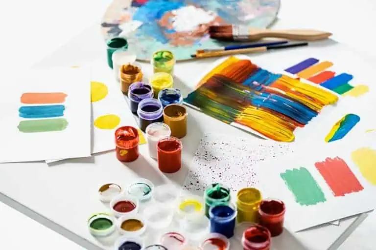
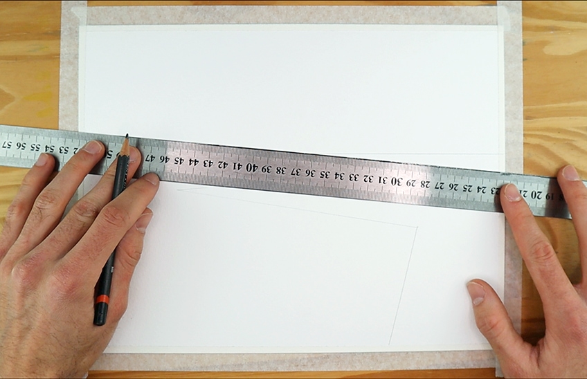
What we need to do is make sure our paper is flat and even. Then we can start cutting the scotch tape both vertically and horizontally along the course of our paper. This tape can be applied to all four edges of the paper, overhanging the paper by one to two centimeters. This will allow us to move our colors through the paper’s edges. This will also create a lovely white border surrounding our work, which will give it a more competent appearance. We’ll also want to ensure we have some fresh water on hand, as well as another for rinsing our brushes during the task.
Finally, let us double-check that we have our colors on hand and ready to use. We’ll be sketching from a picture on an iPad in this lesson, but you may use whatever device you have, or print out the image if you like. Let’s get started with his guide now that we have our color, paper, and water all set up. Remember that a watercolor lesson may be completed in a variety of ways using a variety of approaches.
We’ll be creating a bright and untidy landscape in this lesson. So, now that we’ve got everything ready, let’s get started.
An Easy Watercolor Landscape Lesson for Beginners
We describe an atmosphere through a sequence of color combinations in watercolor scenery and watercolor landscapes. It’s crucial to grasp how the watercolor media interacts with water. It’s just a method of arranging colors in a way that we can comprehend any scene. This means we’ll start with the backdrop, then go on to the center area, and eventually to the foreground. This aids in the development of the watercolor scenery and adds depth to our watercolor landscapes. So, without further ado, let’s get started on this easy watercolor landscape lesson.
Step 1: Creating the Scenery
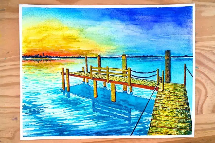
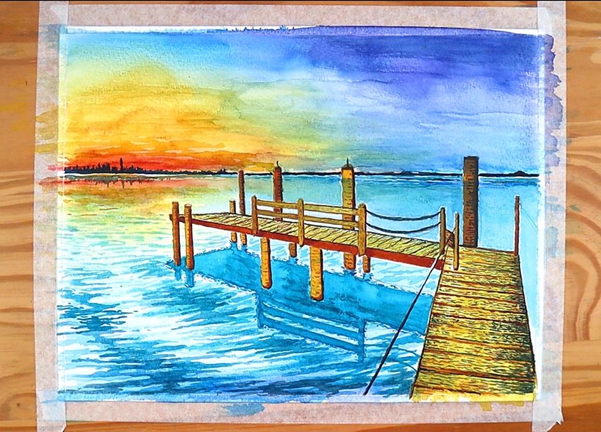
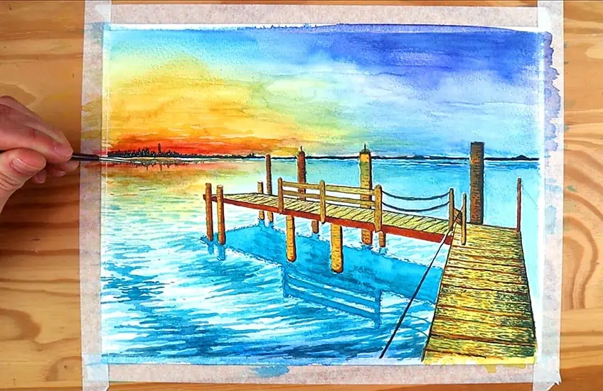
In this lesson, we will create an amazing scenario depicting a pier at sunset in the late afternoon. We may take up the task of literal replication with watercolor, but another fantastic method to do watercolor is to reinterpret your original image in your own unique style. Let’s start by drawing the scenario in our source picture as best we can using a pencil. It’s usually a good idea to start with the horizon line since it provides us a solid idea of how far out the pier should extend.
The dock contains fundamental beams that support its weight, as well as the beams that hold a railing, as we can see from our source picture. We want to keep the proportions perfect, but we may experiment with how many parts of the pier we want to show. We’ll be fine as long as we design something intriguing and the dimensions are appropriate to inspire our paintwork. What we can do is move back and forth from our input images and design until we are pleased with the form and viewpoint of the pier.

We want to make certain that there is something attractive to look at on the pier once more. So, let’s try to include some intriguing details on the dock that will help it stand out in the artwork. Another essential feature is the dock’s reflection in the water, which we may now sketch in. When sketching the dock’s shadow, keep in mind that shadows are frequently the same form. So, to the best of your ability, evaluate the source image for this element, since getting these details properly might help the painting a lot.
After that, we can start adding generic greenery and city-type forms along the horizon line. Along the horizon line, you may create any type of environment you choose. Just bear in mind that the larger it is, the closer it will appear, so keeping these features modest is a smart idea.
Step 2: Wetting the Surface
This is when we moisten the entire page to prepare the paper’s surface. We’ll use a rather broad brush to paint water equally across the entire page. This action will aid in the development of the wet-on-wet approach, which is useful for backgrounds.

Step 3: Creating the Water and Background
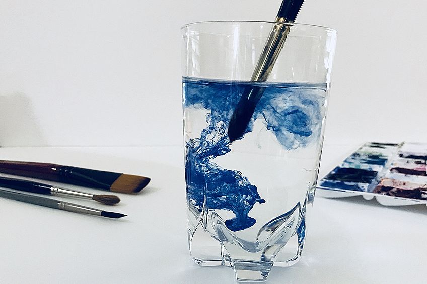
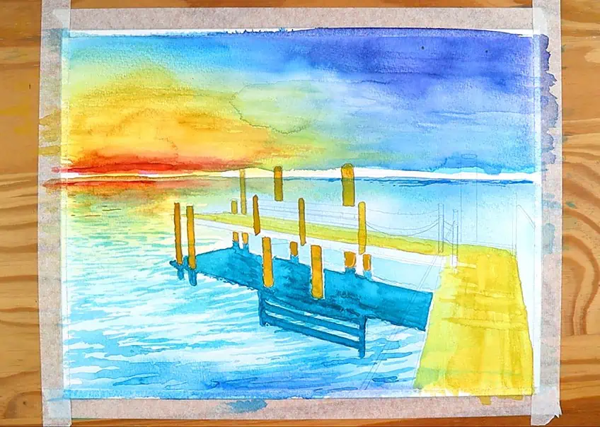
Now we may start painting our picture. We’ll begin by establishing a foundation. This is an excellent strategy to utilize when creating vistas or even nature paintings with watercolor. Although the color scheme of our source image appears to be rather dark, it is a good idea to begin with your lightest hues initially. Let’s start by placing in our yellows. Make sure your brush is damp enough to get a smooth fading effect.

Note that water reflects the sky, thus we may color the water’s hues in proportion to the sky. An excellent idea is to start with the sky and then add the lighter touches to the water as the hues fade on the wet paper. Just above the sunset, we may use our lighter blues. To achieve a smooth fade into the hues, we’ll utilize sweeping broad strokes backward and forward. Keep your paper moist during this step to provide a nice base to paint over later in the guide. Because we want to operate quickly while the paper is still wet, it’s a good practice to mix your watercolors ahead of time so that the pigments are ready. We may also start to add our deeper blues with broad strokes.
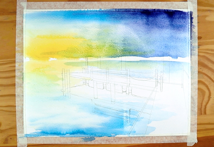
Mixing a little dark blue and purple to produce a richer hue that represents the darkest side of the sky is a nice idea. Ensure to keep your brush damp and your strokes broad. The color transitions become smoother this way. Closer to twilight, we can add a few more dry orange dashes to the yellow. Because the paper dries quickly, we can see the strokes more clearly if we create paint markings in those dry spots. This is useful for creating misty or watery effects. Near sunset, we can draw tiny orange strokes on the waters near the horizon. We may now add a somewhat more crimson stripe to the sunset’s hottest phase, which is usually near the horizon.
In the ocean, we may make a comparable but watered-down movement. Remember that everything in the air is reflected in the sea.
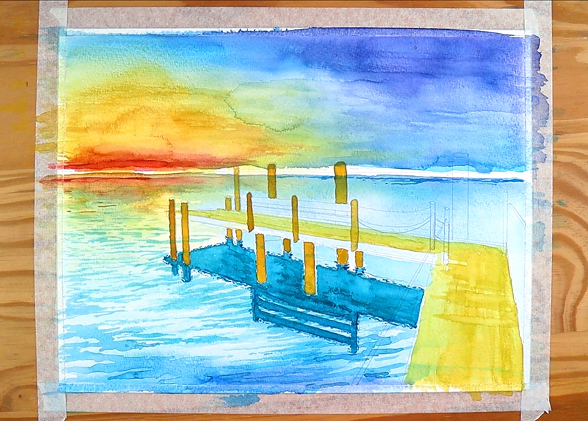
Step 4: Focus on the Water Ripples
Allow us to concentrate on the waters in the foreground as the backdrop dries. The easiest way to create ripples in the ocean is to use a side-to-side movement with heavy to light sweeps. A side-to-side flip of the wrist does this. Also, at times, you should also create more jagged forms.
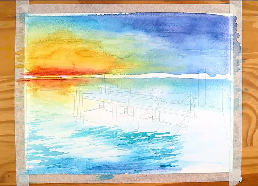
Consider them to be jagged lumps that move from left to right. By sliding the paintbrush side to side, we can generate this effect with both the body and point of the paintbrush. Another thing to keep in mind is that the ocean ripples will always be bigger in the front.
This means that they will become slimmer and finally non-existent as they fade towards the distance.
Step 5: Creating the Dock’s Reflection
We may start by blending our blues together till we get a deeper turquoise blue. We can do this by incorporating somewhat more blue into a blue-green mix, maybe in a 70-30% ratio. You can combine till you get the desired hue. Then, using our source picture as a guide, we can start filling in the reflection’s region. Let yourself relax and do not place too much emphasis on maintaining a consistent tone. It’s fine if the hue of the reflection varies somewhat. This adds complexity to the picture and makes it appear more artistic rather than sketched. You can, nevertheless, adopt a more cautious and methodical approach.
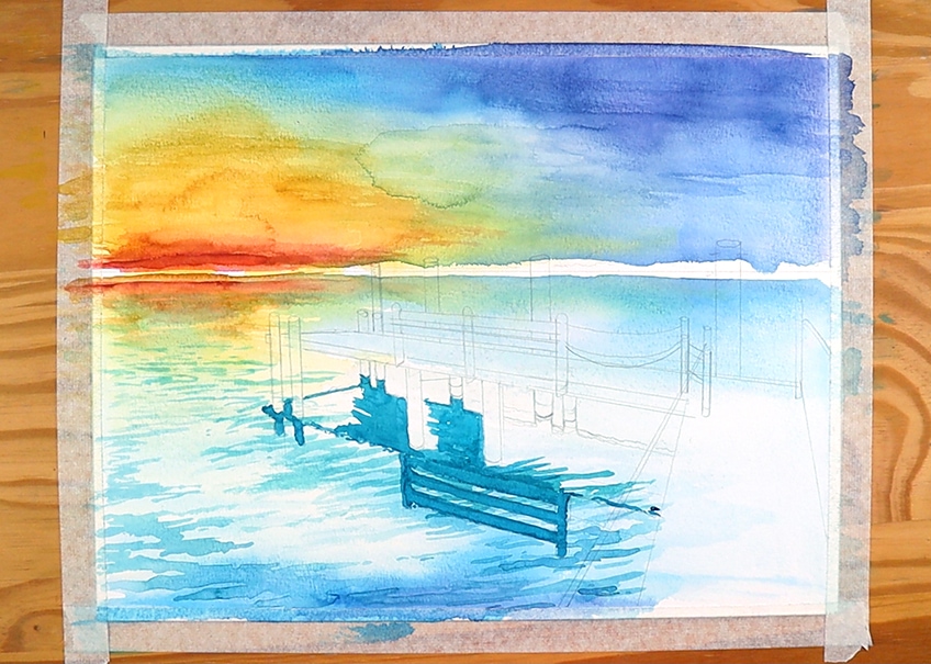
It all hinges on the impact you want to achieve; for this lesson, we’ll attempt to keep things loose because it’s for beginners. Perhaps go over your reflection again, this time with a deeper tone. As it must fall vertically in proportion to the pillars that remain vertically on the pier, make sure it makes sense.
Allow 30 minutes for drying when this is completed.
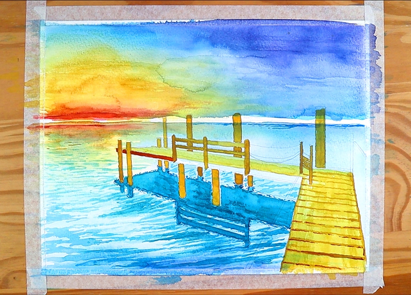
Step 6: Painting the Watercolor Landscape’s Dock
Once our artwork is dry, we may generate a mustard-like tone by mixing a gold brown with our yellow (greater yellow than brown). This hue is a nice counterpoint and will be the lightest element of the dock. Let’s grab a medium-sized brush and start making confident markings along the dock’s edge. For the posts, we’ll add a little more brown color to the yellow. We would like these sections to be a little darker since we want to show that the areas we view aren’t exposed to light. Let us color the posts with caution and attention as we combine our golden brown with yellow. If you’re left-handed, go from right to left; if you’re right-handed, do it the other way.
While the dock dries, let us enhance the reflections of the pier by combining a shade of deep turquoise once again. Begin making small squiggle markings traveling over the perimeter of the reflections with a fine-tipped paintbrush. As the image lies on the water, it will give it a more ethereal effect. Returning to the pier, we can use our warm golden hue to add more features to the composition, such as coloring in the posts and drawing lines on the pier to depict its wooden construction.
If we still have a yellow and brown mixture, add a dash of crimson to deepen and warm it up. This will be used for the border of the port’s pier. Finally, a general rule of thumb is to expand on your previous paint mixtures, starting with the lightest tones and working your way to the darkest hues in your picture. You will not waste any paint this way. This darker brown hue may be used to add extra features to our dock. For ideas, we may look at our source picture to determine where and how we might utilize these hues to help our pier stand out much more.

On the pier, we may use this richer Oakey red hue to create wooden lines. We do this by using our fine brushes to make small, quick strokes along the surface of our pier. This gives the pier a more wood feel, making it stand out more and making it appear more sophisticated. With this deeper color, you may draw any type of mark on the dock.
Consider how the deeper hue may create contrast in the image, enhancing it even more. Create shadows on the posts so that light has a harder time entering them.
Step 7: Coloring the Horizons of Your Nature Paintings With Watercolors
We’ll create a cityscape in this section of the course. To make a deep blue that almost looks black, mix a deeper blue with a hint of black. Take our fine-tipped paintbrush and start to paint little vertical sweeps that resemble a city skyline. We will utilize that dark blue and slide it across the paper in a horizontal line in a calm and steady motion.
While attempting to produce a straight colored line, you can add a line across your color to give you a better idea of linearity. After rinsing and dabbing your brush, paint the cityscape right beneath the horizon line in the other direction. We aim to emulate the features of the little building forms in the sea, comparable to the reflection of the pier.
We don’t need to be concerned with perfection because the goal is to provide more of a sense of reflection.
Step 8: Creating the Details of Your Watercolor Landscapes
At this time, we should have a picture that may be deemed done. Nevertheless, once you’ve completed the most significant portions of the painting, it’s a good idea to always add small touches that improve the painting. For example, using little markings to highlight the pier’s wood is a fantastic idea. We can add all of these small painterly lines to our painting to give the pier in the front a more detailed impression, bringing it out a bit more. This may be done with the railings, strings, and posts around the pier; all of these small details will assist to polish the artwork. But keep in mind that painting is about expressing yourself, so feel free to utilize this as a starting point.
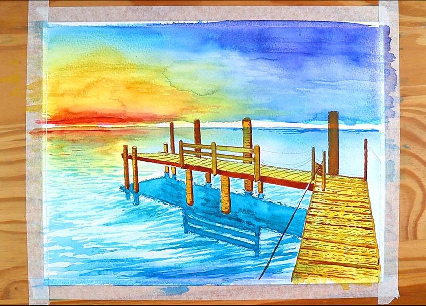
Another nice idea is to add a deeper tone to the sky in the upper right corner, where the light would diminish the most. This tone range can provide a sense of gloom in the distance while also complementing the landscape’s overall contrast. For a hazy look, add some dry orange strokes to the sunset. An excellent tip is to subtly shade the horizon line, providing it with a somewhat deeper tone. Another interesting idea is to use a dark cobalt blue hue and add a few darker spots to the rippling in the water nearest to the foreground.
Let’s add some small white dots near the cityscape after our horizon is dry, as we’ve done a cityscape in the background of our picture. We may create the illusion of city lights by doing so. This is a great little element to use in the artwork to make it more lively. Remember to perform the same thing with the water’s reflection towards the horizon line. Make sure to take one last look at your work, and a good tip is to understand when to quit. Allow the artwork to be finished if you believe it is complete. We might easily overdo it while painting with watercolors, whether it’s a basic watercolor landscape or a nature picture. So, once you feel it’s over, remember to quit.
Now you have it: an easy watercolor landscape lesson in eight easy steps. All landscapes are unique, with some being more natural and others being more modern. The same may be said about the color combinations utilized in a painting, but painting gives you the flexibility to express yourself in whichever way you choose.
Helpful Tips for Your Easy Watercolor Landscapes
Creating simple watercolor scenery is a relaxing and enjoyable project. Always remember that learning a talent takes time, and creating nature paintings with watercolors is a skill that takes a long time to master. When it comes to watercolor painting, there are several approaches and tactics to master.
- First and foremost, take your time. Take pauses during the process and enjoy yourself.
- Start by without wetting the paper too much. Make sure everything is moist and uniformly distributed, but maintain the coating on the surface as thin as possible.
- Always establish the backdrop first, then create the foreground over it, whether you’re producing watercolor nature paintings or modern watercolor scenery.
- To get the painterly impression, keep your markings loose; one method to accomplish this is to grip the brush end rather than the handle like a pencil.
- Allow time for the color to dry after the initial color application. Before painting over the markings, we want the backdrop to be entirely dry.
- Because it is a layered technique, you’ll want to begin light and work your way to the dark.
- Watercolor landscapes generally start with a sketch, so attempt to rough out your scene in pencil before you start painting.
Hopefully, this lesson has enlightened you on how to create a landscape in watercolor. The most essential thing is to give oneself permission to perceive the scene you wish to depict. When painting watercolor landscapes, you may get away with being highly expressive, which usually results in a lovely image. So have a good time with it since it generally leads to the best results.
Frequently Asked Questions
How Do Artists Produce Easy Watercolor Landscapes?
Because all landscapes are unique, the first step is to pick the correct one. Then it’s time to start sketching on the page in a loose and light manner. Then we’ll start building the terrain, which means we’ll start with the background. To accomplish so, we wet the entire sheet with a small layer of water and then begin applying the colors we desire for our landscape using a wet-on-wet technique. Warmth, lightness, color, and naturalness are all possibilities. Then it’s a matter of layering on top of layer after layer. We’re dealing with an additive technique, which means we’re adding layers to a layering process. As a result, always work from light to dark.
Are There Various Watercolor Techniques?
There are a variety of watercolor techniques to choose from. We use the wet-on-wet technique to apply wet paint on a wet surface. This is useful for producing soft, blurred backgrounds as well as seamless gradients. Dry brushing is another option. This approach is excellent for adding details to the softer tones at the finish. This is due to the fact that we are using dry paint, which has a lower translucency than wet paint, resulting in a harsh look. These are only a handful of the tools that may be used to create watercolor landscapes.
How Does Painting in Watercolor Work?
Painting water is actually fairly simple. When it comes to water, you must realize that it may be in a variety of states, from still to moving. It’s all about producing rapid and swift sweeps with a wrist that moves along the plain of your environment while making ripples in the water. This implies that if your landscape’s plain represents a picture in which the liquid should be flowing horizontally, we should make quick wrist strokes from left to right. To create a sensation of reflected fluctuations, we start with light tones and then go on to darker strokes. Finally, you’ll want to preserve negative or white spots in the water to add variety to the shining effect on the water’s surface.

Matthew Matthysen is a multidisciplinary artist. He completed his fine art degree, majoring in History of Art and Contemporary Drawing Practice at the University of Witwatersrand, South Africa. Before joining acrylgiessen In 2020, Matthew worked part-time as an art teacher at Reddford Blue Hills High school. Matthew creates drawing and painting tutorials for acrylgiessen and captures them not only photographically and in written form. He also records the creation of his works in his own creative studio as in video format, from which later with a voiceover and a video editor also drawing tutorials for the Youtube channel of acrylgiessen are created.
Learn more about Matthew Matthysen and about acrylgiessen.