Periwinkle Color – All About This Warm Purple-Blue
This post may contain affiliate links. We may earn a small commission from purchases made through them, at no additional cost to you.
What color is periwinkle? Is periwinkle blue or purple? These are common questions about the periwinkle color. Other people want to know the difference between periwinkle vs. lavender. There are many shades of periwinkle, from light periwinkle to dark periwinkle, and in this article, we will answer all your questions, including providing you with the periwinkle hex code and periwinkle color code in case you want to find the correct periwinkle paint for your home decoration project.
What Color Is Periwinkle?
The periwinkle color is named after a plant known as the lesser periwinkle. Another name for this beautiful color is lavender blue, so if you are wondering what the difference is between periwinkle vs. lavender – it is lavender mixed with a little amount of blue. As a result, it is considered a cool hue, but a warm blue. The periwinkle color therefore has an intriguing element to it: while it belongs to the spectrum of cool hues, shades of periwinkle have an inherent warmth and appear more inviting than straight blue.
Both blue and lavender are colors that often feature in interior design, so it is no wonder that the periwinkle color is also a great color choice for the inside of your home too.
| Shade | Hex Code | CMYK Color Code (%) | RGB Color Code | Color |
| Periwinkle | #ccccff | 20, 20, 0, 0 | 204, 204, 255 |

The Meaning of the Periwinkle Color
For a long period of time, researchers have examined the influence of various colors on human nature. Periwinkle is another color in the blue family that has a relaxing, uplifting influence on the human psyche. Its subdued colors elicit thoughts of joviality, cheerfulness, and humor in the beholder. It’s a fantastic choice for companies and classrooms, where it may assist foster a productive atmosphere. Periwinkle symbolizes tranquility, calm, and coolness. It may also represent new relationships, nostalgic recollections, and eternal love. In graphic design, different hues of this color tend to suggest refinement, balance, and reliability.
Periwinkle flowers have long been associated with hope. It was claimed in the Middle Ages that if a captive could get hold of the flower and sniff it, their captor would release them. This exquisite tiny flower’s blue-purple tint is also supposed to symbolize constancy, affection, and compassion.
These lovely flowers are frequently presented as a consolation or support to those who have experienced a loss.
It’s also typical for brides to put a periwinkle in their bouquets for good luck when they get married. Periwinkle has also long been associated with romance, security, and devotion. Georgia’s national flower is the periwinkle. It can even represent power and integrity. This flower expresses a plethora of positive feelings!
The color of the flowers you give someone can depend on the occasion. Some may believe that offering somebody a periwinkle-colored flower is a simple act, but there are a variety of explanations why you would choose to present this specific color flower. For instance, if somebody has been through anything painful or unpleasant circumstances and needs support to overcome them, a periwinkle-colored flower would be ideal because it connotes “tranquility”. There are several different connotations associated with giving somebody a periwinkle-colored flower, making it an excellent flower for any circumstance.
The periwinkle is adaptable enough for any scenario, even if you’re feeling sentimental, want to convey thanks, or need some solitude and space from your companion.

The History of the Periwinkle Color in Art
Periwinkle is named after a beautiful flower. When the periwinkle flowers are in bloom, it’s difficult to look at anything else. The delicate hue is an unbelievably ethereal tint, making it feel like you are living a real-life Impressionist painting. Periwinkle is known by many different names in different places.
For example, in Italy, she is known as the “Flower of Death,” since it was customary to place wreaths on the gravesites of deceased children. The flower has been connected with both marriage and executions. The color seems to have connotations of both life and death, just like the flower it is named after.
The periwinkle plant, for example, contains alkaloids, which can be quite harmful if consumed in the form of a blooming vine. Yet, a drug derived from the Madagascar Periwinkle plant can attack cancer cells.

The Use of Periwinkle in Art Through the Ages
Periwinkle was first used as a name for the color in the 1920s, although it had been in the painter’s arsenal for much longer, simply referred to as a shade of violet. A periwinkle also happens to be a sort of snail, albeit not one that creates a purple liquid like those used in the past to create a color comparable to modern periwinkle called Tyrian purple. Tyrian purple was a challenging hue to create. One ounce of dye required the secretion of thousands of sea snails.
While various colorants may be used to create different hues of purple, Tyrian continued to be an important hue until the advent of mauveine.
| Shade | Hex Code | CMYK Color Code (%) | RGB Color Code | Color |
| Tyrian Purple | #66023c | 0, 98, 41, 60 | 102, 2, 60 |
Under the umbrella of violet, shades of periwinkle can be observed in many artworks of the past. Violet was extremely important to European impressionist painters—and extremely upsetting to its detractors. The instigating moment in the critics’ assault against the use of this shade, was Monet’s Impression, Soleil Levant (1872).
“Wallpaper in its unfinished condition is more polished than that seascape,” Louis Leroy commented after viewing the blurry sight.
| Shade | Hex Code | CMYK Color Code (%) | RGB Color Code | Color |
| Violet | #ee82ee | 0, 45, 0, 7 | 237, 130, 237 |
It’s a seascape, but it’s also a piece about color. The colors are hazy blues, grays, and faint violets. In Paris in the 1870s, the more daring galleries were overflowing with hazy vistas, portraiture, and still lifes linked by their methods and unusual, almost surreal hues. These visuals appear ordinary to 21st-century sensibilities, but reviewers were underwhelmed. Human skin had become purple, green and orange moaned the creative elite. Naturalism had been replaced by these periwinkle color “abominations”.
While the Impressionists are undoubtedly the most well-known 19th-century innovators (their hazy blossoms make for wonderful merchandise), there were other trends underway at the same time. Symbolism, an artistic form that precedes the 20th-century surrealist explosion, combined aspects of exquisite Romanticism and dramatic Rococo with Modernist abstraction to produce artworks that were passionate, often highly elaborate, exaggerated, and, above all, dreamlike. Periwinkle was a popular hue during the Rococo period.
Periwinkle, along with other hues like ivory, beige, and mild pastels, supplanted the vivid colors of the baroque era.
In comparison to the Impressionists, who worked from nature and strove hard to represent precisely how we perceive colors in the natural – thus all those violet sunset skies – the symbolists believed that a little absurdity in art was necessary to bring the audience closer to seeing a fundamental truth. They sought to depict how passion felt or what insanity implied, so they created worlds filled with allusions to stories and symbolism. They were inspired by pagan faiths in principle and loved Greek mythology in particular—for the symbolists, mysticism was far more vital to art than realism.
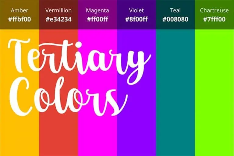
While the Symbolists and Impressionists had quite different objectives, both groups depended extensively on specific colors, particularly secondary colors – emerald, marigold, tangerine, and, notably, violet tones such as periwinkle.
| Shade | Hex Code | CMYK Color Code (%) | RGB Color Code | Color |
| Emerald | #50c878 | 60, 0, 40, 22 | 80, 200, 120 | |
| Marigold | #ffd700 | 0, 16, 100, 0 | 255, 215, 0 | |
| Tangerine | #f28500 | 242, 133, 0 | 0, 45, 100, 5 |
If you are an artist or photographer and wish to capture the periwinkle color in nature, the perfect time to see the periwinkle color is the golden hour, which occurs approximately 60 minutes before the sun crosses the horizon. At that time the sky is colored in different hues of indigo, periwinkle, and mauve for around 20 minutes. Many of these periwinkle sunsets were also depicted in Symbolist paintings, such as The Call of the Sun (1919) by Nicholas Roerich.

Unlike Impressionist works, which have strong layers of paint and textures, symbolist works appear to be intended for a screen. They’re frequently flat, with large swathes of opposing color. Some of these artworks are cartoonish, almost infantile, and one could imagine seeing them in a children’s book.
These works may be heartbreakingly beautiful at times, although slightly crazy, such as naked ladies dancing in the periwinkle dusk or lovers embracing in a shimmering world.
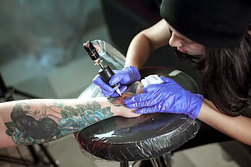
The Use of Periwinkle Color in Tattoos
Periwinkle tattoos are frequently paired with blue and are supposed to signify optimism, calm, and tranquility. It can also represent the newness of spring. Periwinkle tattoos are also a symbol of loyalty, commitment, and honesty. The significance of this ink color is that the person who wears it will always keep their promises. Periwinkle tattoos are frequently meaningful and can have diverse interpretations depending on the shade.
For instance, if you want to represent hope or confidence, a bluer periwinkle is your best choice. A stronger hue of blue would indicate peace, while light periwinkle tones may be utilized to express gratitude to somebody in your life.
The Various Shades of Periwinkle
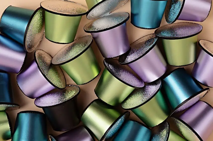
When it comes to using the periwinkle color in your art or home, there are several shades of periwinkle to choose from. The most common periwinkle color is called true periwinkle. Deep periwinkle (gun powder) is another popular choice, a rather subtle shade in comparison to the relatively brighter shade of dark periwinkle (wild blue yonder), which is a great color to liven up a room.
Light periwinkle (blue chalk) is a relaxing and gentle shade that is a mix of equal parts purple and blue.
| Shade | Hex Code | CMYK Color Code (%) | RGB Color Code | Color |
| Periwinkle | #ccccff | 20, 20, 0, 0 | 204, 204, 255 | |
| Blue Chalk | #eaecfe | 8, 7, 0, 0 | 234, 236, 254 | |
| Wild Blue Yonder | #8184a8 | 23, 21, 0, 34 | 129, 132, 168 | |
| Gun Powder | #404254 | 24, 21, 0, 67 | 64, 66, 84 |
Making Your Own Periwinkle Paint
It’s recommended to mix your own periwinkle paint using the correct periwinkle color code or periwinkle hex code, especially for minor undertakings, because it’s less expensive to do so than to have it matched and mixed by a retailer. Decide on a color by searching online for ideas from design experts. Perhaps you can acquire a distinct color palette from a different culture.
Your house is your haven and it should make you feel comfortable.
To make the periwinkle color, begin with a pink base by mixing white and red paint. To make purple, add accents of light blue. Now add blue or violet until you get the color you prefer. Adding too much blue will result in sapphire blue. And if you use too much violet color, it will turn into an aubergine color. To get the desired color, add a bit at a time.
Good Color Combinations with Periwinkle
Now that you have chosen which of the shades of periwinkle you want to incorporate, the next step is to figure out which other colors you would like to combine with it. Therefore, we have created a list of suitable colors that go with periwinkle perfectly. If you are thinking of using a neutral color, then gray or white are said to be safe options. Some shades of brown, as well as black, can also be used, however, it is important to match the shades beforehand to avoid clashing. Periwinkle’s subtle hue allows it to be used in large amounts without being overpowering, making it ideal as a room’s feature wall or focal point.
Periwinkle matches a wide range of color palettes, since it contains both purple and blue tones.
Navy
The first color on our list is navy. Any shade of periwinkle will look fantastic with navy. It can highlight the bluish tones without dominating the purple.
It allows a delicate hue to glow while also being regal and classy.
| Shade | Hex Code | CMYK Color Code (%) | RGB Color Code | Color |
| Navy | #000080 | 100, 100, 0, 50 | 0, 0, 128 |
Mint Green
Next up is the fresh color of mint green. Mint green is a great color for keeping things looking and feeling cool and clean. This is ideal for a shade with greenish undertones, but it also works nicely with deeper, violet periwinkle.
| Shade | Hex Code | CMYK Color Code (%) | RGB Color Code | Color |
| Mint | #3eb489 | 66, 0, 24, 29 | 62,180,137 |
Salmon
Salmon is a trendy yet challenging hue to deal with. You don’t want to devalue a room by using the incorrect hue. Periwinkle can really stand out when the right salmon color is used, but if the incorrect shade is used, it can look awful.
| Shade | Hex Code | CMYK Color Code (%) | RGB Color Code | Color |
| Salmon | #ff8c69 | 0, 45, 59, 0 | 255, 140, 105 |
Sage Green
Perhaps you would like to create a sense of the outdoors in your home using color. One hue to explore is sage green. Because of the forest-like natural tones, it works with most colors.
It feels natural with any layout when combined with periwinkle.
| Shade | Hex Code | CMYK Color Code (%) | RGB Color Code | Color |
| Sage | #87ae73 | 22, 0, 34, 32 | 135,174,115) |
Yellow
Yellow is also a good color to consider. Any yellow tint can improve the appearance of periwinkle wallpaper, for example. Yellow and bluish tones are often found together in interior designs, and therefore this combination works very well together.
A favorite is cyber yellow.
| Shade | Hex Code | CMYK Color Code (%) | RGB Color Code | Color |
| Cyber Yellow | #ffd500 | 0, 16, 100, 0 | 255, 213, 0 |

Dark Silver
While many of the colors that work well with the periwinkle color are neutral, silver can also work beautifully in combination with periwinkle. Unless you add too much red, periwinkle is considered a cool color and therefore a great accent for the silver color.
| Shade | Hex Code | CMYK Color Code (%) | RGB Color Code | Color |
| Dark Silver | #706e72 | 2, 4, 0, 55 | 112, 110, 114 |
Black
Periwinkle and black are complementary colors. Any periwinkle hue complements black in any context. You may even try a dark periwinkle to see how it changes your environment. It does, however, have a contemporary feeling rather than a rustic or rural feel.
If you want a more classic or country-style appearance, mix it with greens, yellows, or even navy blue.
| Shade | Hex Code | CMYK Color Code (%) | RGB Color Code | Color |
| Black | #000000 | 0, 0, 0, 100 | 0, 0, 0 |
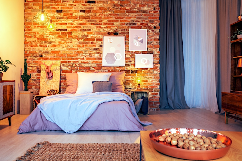
Decorating Your Rooms With Periwinkle
Periwinkle is a naturally vibrant color. Because a small amount of periwinkle goes a very long way, it is necessary to utilize it in light tones and mostly in decorations for a visually appealing design. Periwinkle décor may be simply incorporated into every area of the house, from the living room to the bedroom. Periwinkle, when used correctly, may create a setting with timeless charm. Periwinkle also makes economic sense.
In a now-famous paint-color study by Zillow, homes with periwinkle or powder-blue bathrooms sold for $5,000 more on average than others.
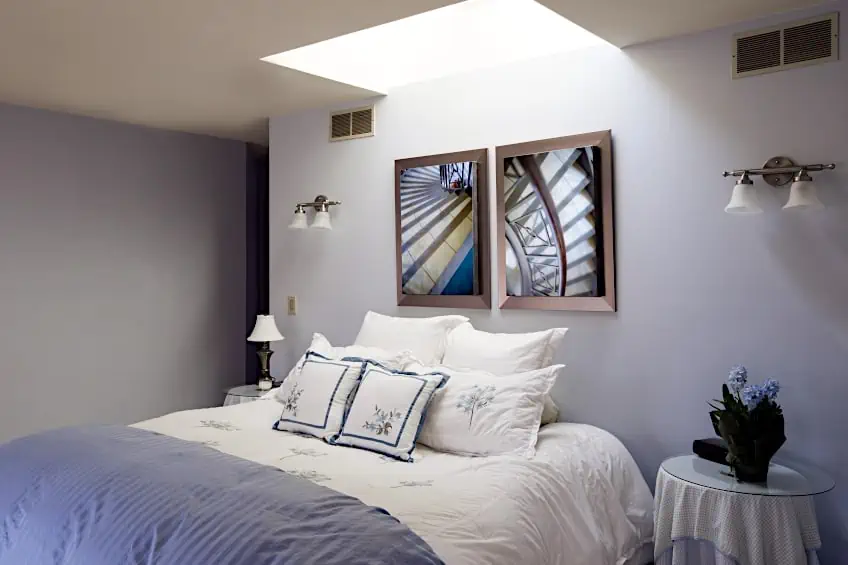
Using Periwinkle Paint on Your Walls
For a delicate background of color across the space, pick the faintest or lightest periwinkle tone. Use wallpaper to accent a wall with a damask design in a periwinkle hue that complements the light hue of the remaining walls for extra dimension and texture. Large wallpaper prints offer the room’s design a new look while also adding visual intrigue. Decorate with clean, white trims and doorways.
To accentuate the cooling character of the periwinkle walls, finish the space with a white ceiling in a chill white tone.
Combining Periwinkle With Neutral Gray Floors
Include a neutral gray colored floor that contrasts with the periwinkle background. Because flooring is frequently a costly and constant element of design, adopting a neutral gray tone rather than periwinkle assures its longevity. Select wood flooring with gray tones in moderate or dark tones.
Or, instead, use a moderate gray tone such as dim gray for the carpets in the bedrooms to complement the wall color while not revealing as much discoloration over time as the lighter variations.
Add a little rug to any area that has a cool hue such as dim gray, periwinkle, and parchment white themes that complement the room’s aesthetic. Place it behind the furniture arrangement to anchor the area and blend the room’s colors for a unified aesthetic.
| Shade | Hex Code | CMYK Color Code (%) | RGB Color Code | Color |
| Dim Gray | #696969 | 0, 0, 0, 59 | 105, 105, 105 | |
| Parchment | #FCF5E5 | 0, 3, 9, 1 | 252, 245, 229 |

Upholstered Pieces: Which Color to Incorporate
Employing white upholstered furniture provides a neutral finish to any area that incorporates the periwinkle theme. Valuable items, such as expensive furniture, should always be painted in a neutral color to ensure optimal usage.
With all that in mind, add a few ivory-colored sofas and tables to act as a palette for the accompanying periwinkle accents.
| Shade | Hex Code | CMYK Color Code (%) | RGB Color Code | Color |
| Ivory | #FFFFF0 | 0, 0, 6, 0 | 100, 100, 94.1 |
What Arty Focal Points to Include in Your Periwinkle-Themed Room
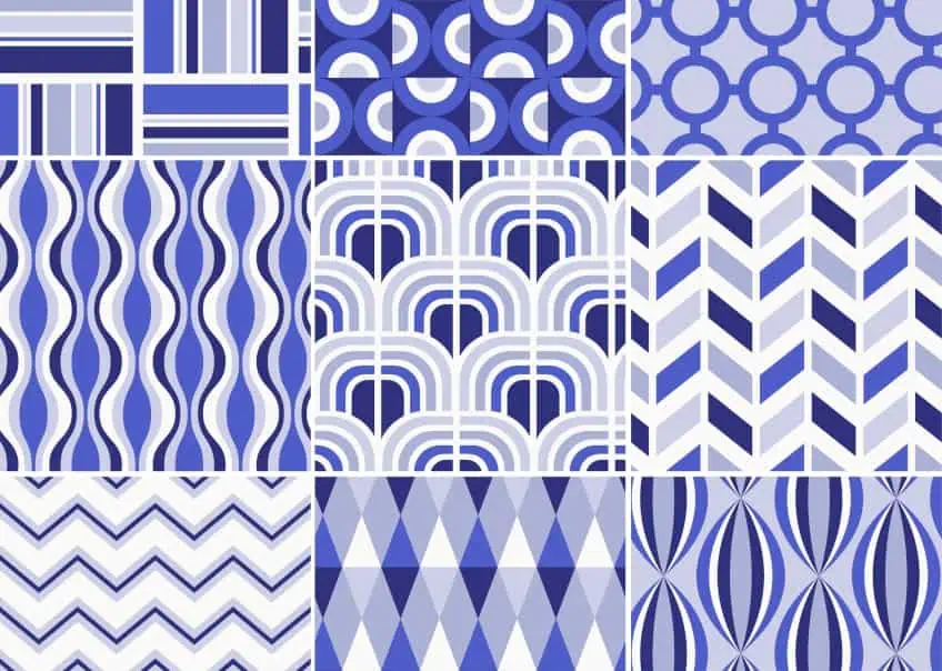
Include huge artwork pieces to provide a point of focus in the periwinkle-colored space. In modern rooms, hang large-canvas geometric patterns with periwinkle on a wall over a couch or fireplace. Install a huge landscape painting of blooming periwinkles in a frame on the wall over the bed’s headboard as an optional extra that integrates periwinkle with the other colors in the area for a more traditional look.
Decorative Accents in Periwinkle
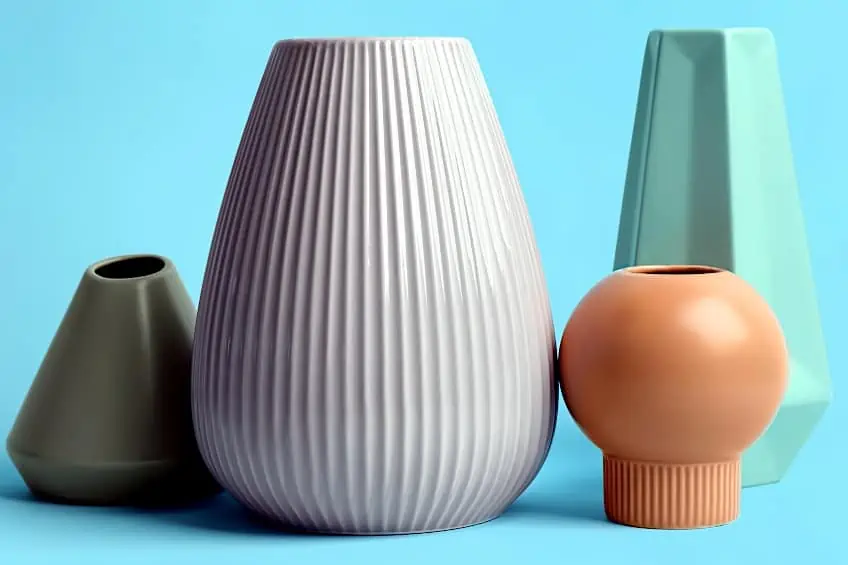
Embellish the periwinkle room in a variety of ways to tie the color scheme together in a stylish way. Fill a bed or couch with a choice of periwinkle cushions. To make the areas appear more beautiful, use satin, velvet, and beaded cushions. Add a periwinkle shawl on the arm of a chair or the foot of a bed. For a slight splash of color, arrange periwinkle-colored candles on a coffee table. Display a periwinkle ceramic collection on a mantelpiece.
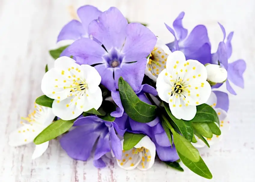
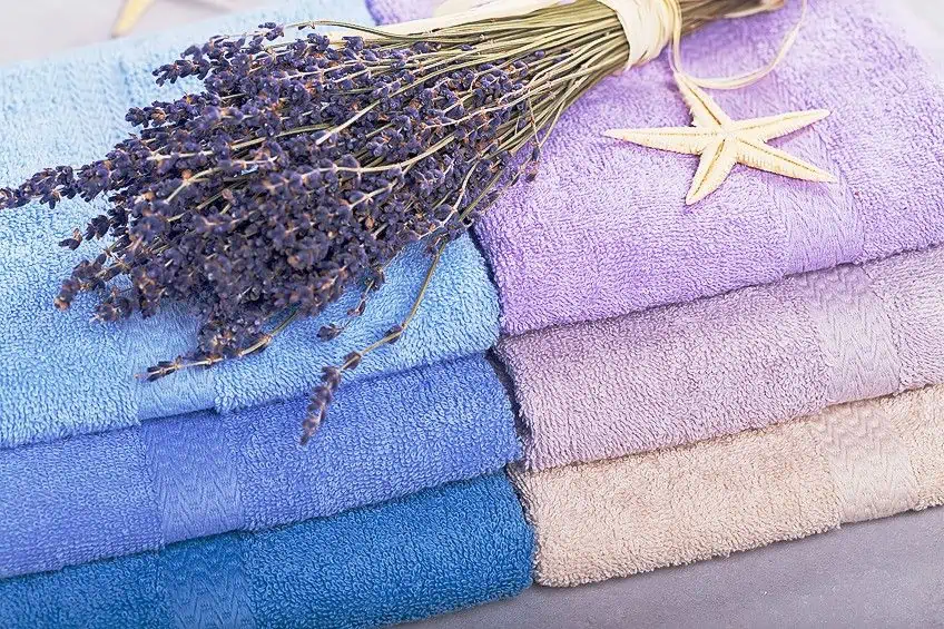
Arrange a bunch of periwinkle flowers in a vase and add it to any space for a finishing touch.
Periwinkle is a faint violet hue named after the flower. The flower was usually placed on the graves of the deceased. In fact, it was done so often that if people saw a patch of flowers growing, many would naturally assume that it was the location of a cemetery. It is blue with purple undertones and falls between the two on the color chart. As we have learned, the cool tones of periwinkle act as a perfect and subtle background color to add an elegant sheen and cool atmosphere to your home.
Take a look at our periwinkle blue webstory here!
Frequently Asked Questions
Is Periwinkle Blue or Purple?
That could be a trick question. Periwinkle is neither blue nor purple, yet both at the same time! It is a hue of blue, with a purple undertone. It is often also known as violet-blue. As a color, it had been used in the arts for many years, along with blue and purple, yet it would not be until the 1920s that the distinctive color was given its own name, and was no longer just considered a type of violet-blue.
What Is the Meaning of the Periwinkle Color?
Periwinkle is a blueish hue that has a calming and elevating effect on the mind. Its subtle hues evoke feelings of joy, happiness, and fun in the viewer. Periwinkle signifies serenity, peace, and freshness. It might also indicate fresh partnerships, good memories, or universal love. Different shades of this color are associated with elegance, equilibrium, and dependability in graphic design. Periwinkle flowers have always been connected with optimism. It’s an excellent choice for classrooms and office spaces, where it may help build a productive environment.
How Can I Use the Periwinkle Color in My Home?
Periwinkle paint may be used on your walls. To provide a beautiful color backdrop across the space. Incorporate a neutral gray floor to contrast the periwinkle background. Using white upholstered furniture adds a neutral touch to any space that integrates the periwinkle motif. Include large artworks pieces to create a focal point in the periwinkle-colored area. Adorn the periwinkle space with a number of accent pieces.

Duncan graduated with a diploma in Film and TV production from CityVarsity in 2018, after which he continued pursuing film while taking on a keen interest in writing along the way. Since having graduated, he began working as a freelance videographer, filming a variety of music videos, fashion and short films, adverts, weddings and more. Throughout this, he’s won a number of awards from various film festivals that are both locally and internationally recognized. However, Duncan still enjoys writing articles in between his filming ventures, appreciating the peace and clarity that comes with it.
His articles focus primarily around helping up-and-coming artists explore the basics of certain colors, how these colors can be paired with other shades, as well as what colors are created when you mix one with another. All while relating these shades to historically significant paintings that have incorporated them into their color palette. As a lover of the arts himself, he takes great interest in the Renaissance era of paintings, an era that has directly inspired many of his favorite films.
Learn more about Duncan van der Merwe and about us.