Split Complementary Colors – How to Use a Complementary Color Palette
This post may contain affiliate links. We may earn a small commission from purchases made through them, at no additional cost to you.
Color is everywhere around us; in nature, in art, and in design. However, it might be difficult to choose a color scheme that works for your designs. Selecting a good color combination can be done by understanding certain color principles. These methods can be used to choose colors and will most likely include things like the best split complementary color scheme. So, let us take a closer look at what split complementary colors are.
What Are Split Complementary Colors?
When you are first learning about colors, it can be a bit overwhelming with all the possibilities out there. It is not simply a matter of choosing a color but understanding how you made your choice that will matter. When it comes to art and things like graphic design, learning all about color theory will make your job much easier. Once you have gained knowledge of the different terms including complementary and split complementary colors, you will be creating and pairing colors in no time.
What Is a Complementary Color Scheme?
Before we deal with split complementary colors, we should look at complementary colors. Most of us have a basic knowledge of what a color wheel is, as well as what the primary and secondary colors are. It is always good to start with a good foundation before moving on to more complicated ideas. A reminder for those who might have forgotten, primary colors include your red, yellow, and blue colors, while your secondary colors are a combination of your primary colors and include orange, green, and purple. All these colors can easily be seen so you can refer to them on a color wheel. Complementary colors always lay on the opposite sides of each other.
For example, take red, of which the complementary color is green. Therefore, this color scheme consists of a single primary color and another single secondary color.
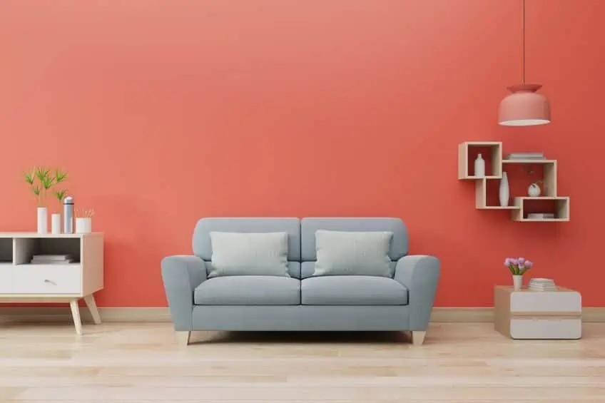
When using these colors in a design, they can create a nice contrast in color, making each other stand out more. These colors will be the first to get your attention, which is why website designers use them. Interior designers can also use this contrast to bring in brighter colors to a room. However, a complementary color palette must be used wisely as it could also create something overpowering and unpleasant to look at. So, the best option is to choose a dominant color and use the other as more of an accent color to balance out the effect.
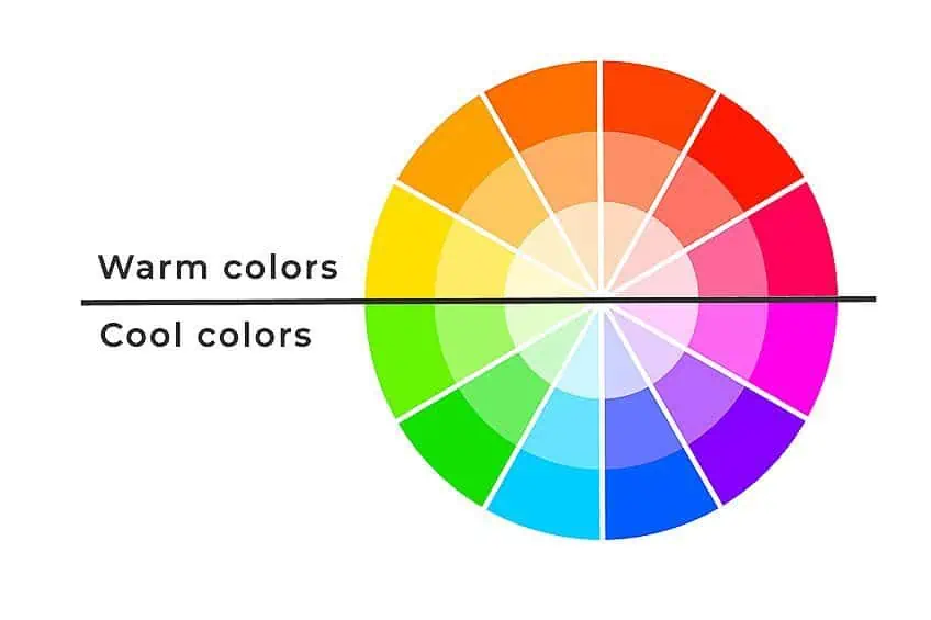
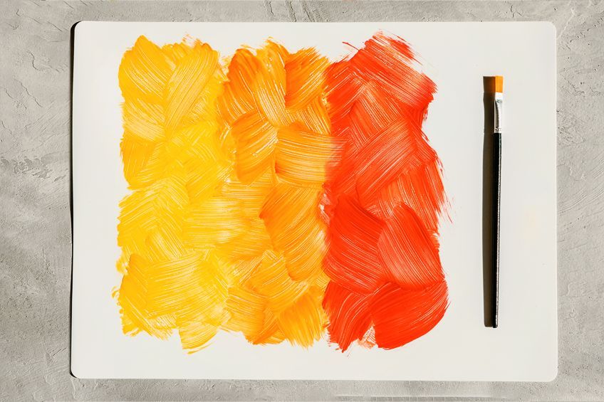
When blending these colors while painting, you can use them to tone down colors and produce a more neutral gray-scale color. Also, each of the complementary colors is either warm or cool. For example, again the red is warm and represents heat and sunshine, while green is considered cool and creates a calming effect. This is also known as color bias or color temperature. Not only do you get one pair of complementary colors, but you can also have a double complementary color scheme. This means that you have two colors that are next to each other and two colors opposite them. So, you will have four colors, for example, Orange and blue, and blue-green and red-orange.
| Shade | Hex Code | CMYK Color Code (%) | RGB Color Code | Color |
| Orange | #ffa500 | 0, 35, 100, 0 | 255, 165, 0 | |
| Blue | #0000ff | 100, 100, 0, 0 | 0, 0, 255 | |
| Blue-Green | #0d98ba | 93, 18, 0, 27 | 13, 152, 186 | |
| Red-Orange | #ff5349 | 0, 67, 71, 0 | 255, 83, 73 |
Color Harmony
AS we have mentioned, using too many contrasting colors can create a color scheme that does not work. You have to balance the colors to create harmony so that when you look at the color scheme, it is pleasing to the eye. We have dealt with the complementary and double complementary color scheme, but what other combinations of color do you get before we delve into split complementary colors?
- Triadic Color Scheme: As the name implies, these are three colors that are evenly spaced from each other when you measure them on the color wheel.
- Analogous Color Scheme: These can involve three colors, all of which are adjacent to one another on the color wheel.
- Tetradic Colors: This consists of base colors and three colors that are all the same distance from each other. There are two sets of complementary colors, for example, green, blue, orange, and red.
- Square Colors: These are four colors that are squarely spaced on the color wheel.
- Monochromatic Colors: These are various shades or tones of the same color family.
What Is a Split-Complementary Color Scheme?
A split complementary color scheme is simply another option for your complementary color palette. However, instead of having only two colors, there are now three. This always involves selecting a primary or base color and then searching opposite this color for two adjacent colors. So, when choosing a color, and then finding its complement, the colors for a split complementary will the two colors on opposite sides of the complementary color.
You do not have to stick to three, you can also add a fourth or maybe more, and it will remain a split complementary. For example, what color complements orange? This would be blue, so your split complementary colors will then be blue-purple and blue-green.
Your Main Split Complementary Colors
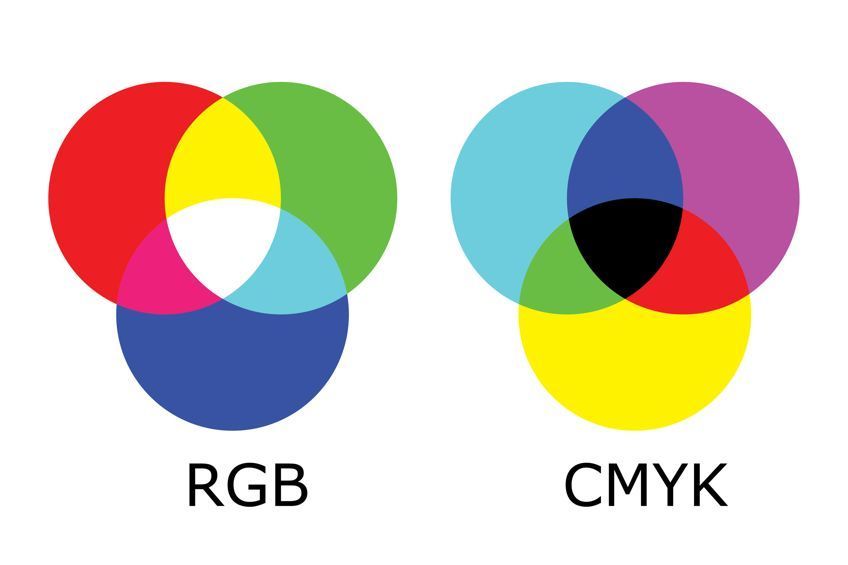
Most of us know the traditional color wheel, but there are also other more modern color theories that you can use. Each of these theories have their own color wheel, so you will have slightly different color combinations. Two main theories include your red, yellow, and blue (RYB) model that we all learned in school. Then you have your red, green, and blue (RGB) model that is used mostly for graphic design and online. There is also a third option that is used for printing and is known as your cyan, yellow, magenta, and black (CMYK) model. Let us look at a few of the complementary and split complementary colors of the first two models.
RYB Model
This is often used by artists and painters to create beautiful pieces of art with an array of paint colors. This is also known as a subtractive color model where pigments are used to create color and include your primary colors of red, yellow, and blue.
- What color complements purple? Yellow would be the complement of purple. So, split complementary colors would be yellow-green and yellow-orange.
- What color complements orange? Blue is the complementary color with blue-green and blue-purple or violet being the split complementary colors.
- What color complements blue? As the opposite of the above, orange is the complementary color, while the split complementary colors are yellow-orange and red-orange.
- What color complements red? Green is the complementary color of red, and the split complementary colors will be green-yellow and blue-green.
| Shade | Hex Code | CMYK Color Code (%) | RGB Color Code | Color |
| Purple | #800080 | 0, 100, 0, 50 | 128, 0, 128 | |
| Yellow-Green | #9acd32 | 25, 0, 76, 20 | 154, 205, 50 | |
| Yellow-Orange | #ffae42 | 0, 32, 74, 0 | 255, 174, 66 | |
| Orange | #ffa500 | 0, 35, 100, 0 | 255, 165, 0 | |
| Blue-Green | #0d98ba | 93, 18, 0, 27 | 13, 152, 186 | |
| Blue-Purple | #8a2be2 | 39, 81, 0, 11 | 138, 43, 226 | |
| Blue | #0000ff | 100, 100, 0, 0 | 0, 0, 255 | |
| Yellow-Orange | #ffae42 | 0, 32, 74, 0 | 255, 174, 66 | |
| Red-orange | #ff5349 | 0, 67, 71, 0 | 255, 83, 73 | |
| Red | #ff0000 | 0, 100, 100, 0 | 255, 0, 0 | |
| Green-Yellow | #adff2f | 32, 0, 82, 0 | 173, 255, 47 | |
| Blue-Green | #0d98ba | 93, 18, 0, 27 | 13, 152, 186 |
RGB Model
This model is mainly used to created beautiful images on your computer or television screen and is also known as your additive color model. This means that your colors are produced by light and the primary colors involved include red, green, and blue.
- What color complements red? In this case, cyan is the complementary color of red with green-cyan and blue-cyan as split complementary colors.
- What color complements green? Magenta is the complementary color here, with purple and rose as split complementary colors.
- What color complements yellow? Blue and the split complementary colors are green-yellow and orange.
- What color complements blue? Orange and the split complementary colors are blue-cyan and purple.
| Shade | Hex Code | CMYK Color Code (%) | RGB Color Code | Color |
| Red | #ff0000 | 0, 100, 100, 0 | 255, 0, 0 | |
| Green-Cyan | #0cbaa6 | 94, 0, 11, 27 | 12, 186, 166 | |
| Blue-Cyan | #0d98ba | 93, 18, 0, 27 | 13, 152, 186 | |
| Green | #008000 | 100, 0, 100, 50 | 0, 128, 0 | |
| Purple | #800080 | 0, 100, 0, 50 | 128, 0, 128 | |
| Rose | #ff007f | 0, 100, 50, 0 | 255, 0, 127 | |
| Yellow | #ffff00 | 0, 0, 100, 0 | 255, 255, 0 | |
| Green-Yellow | #adff2f | 32, 0, 82, 0 | 173, 255, 47 | |
| Orange | #ffa500 | 0, 35, 100, 0 | 255, 165, 0 | |
| Blue | #0000ff | 100, 100, 0, 0 | 0, 0, 255 | |
| Blue-Cyan | #0d98ba | 93, 18, 0, 27 | 13, 152, 186 | |
| Purple | #800080 | 0, 100, 0, 50 | 128, 0, 128 |
How to Incorporate a Split Complementary Color Scheme
A split complementary color scheme is less vibrant or tends to clash less as they are not direct opposites. These are often better for beginners to use as you cannot easily go wrong with this color scheme. Split complementary colors provide a similar effect to your complementary colors, but they are a little more versatile and provide more of a balance of warm and cool colors. A split complementary color scheme also gives you more colors to work with.
Even though this type of color scheme is easier to work with, more colors added into the mix could be intimidating. If you are a beginner, you might fail to create an effective color scheme. So, whatever you are doing, be it art, graphic design, or fashion, the secret is to find the dominant color and use this more as your accent color to bring in more vibrancy.
Consider, yellow as your base color, so your complementary colors are then red-purple and blue-purple. You might want to use more of your split complementary colors and add in accents of yellow. In a room, maybe you can use yellow as various décor items like pillows or wall hangings. Let us use blue as another example, your complementary colors are then yellow-orange and red-orange. You can use blue as your base color and bring in the other colors as items throughout the room to bring in more energy and light.
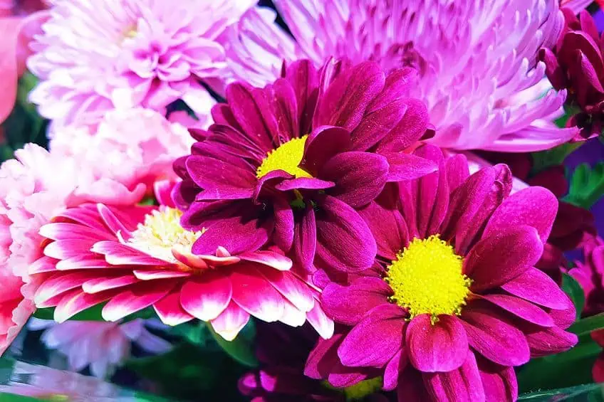
Split complementary colors can also be used in things like quilting, crafting projects, and floral design, where you can use different color flowers to create a beautiful arrangement for your home, or at events like weddings. It might take some experience and learning about color theory, but when painting, split complementary colors can work well. You can create a balanced contrast when using these colors, which can also help to liven up the painting more and provide more of a balanced sense of color. A basic understanding of how to use complementary colors involves using your two split complementary colors to create your general painting and then the third more dominant color as an accent.
This can work in graphic design as well, use only the accent colors where you want to draw attention, for example, a click here button you want visitors to see clearly,
In conclusion, this type of color scheme may be easier to work with, however, there are some things you should avoid doing. Using a split complementary color scheme can still produce an overwhelming image, so the best thing to do, is not to go overboard. Although it is a little more difficult to go wrong with complementary colors, there is still a small window where you can overdo a color, which then produces a less harmonious color scheme. To summarize, the best way to use split complementary colors is to choose your dominant base color. This can be the main color paint for your room, the main color for your clothing design, or the largest number of flowers in an arrangement. You can then use the other two colors as your accents.
Creating a Split Complementary Color Palette for Graphics
To create your color palette, you need to begin with choosing one color, and from there you can adjust the color to achieve the look you are going for. To do this, many graphic designers use the hue, saturation, and lightness (HSB) model. This is simply a tool you can use to pick and change colors in a graphics program. Adjusting the hue will change the color, adjusting the saturation, will alter the vibrancy, for example, a less saturated blue creates a muted blue tone. Lastly, changing the brightness, makes a color darker or lighter. Most graphic colors can be identified using a hex or hexadecimal code, which is simply a way colors are represented.

You can choose to use a graphics program and change the colors yourself, which might take a little time to learn and understand, or simply use an online color picker or color calculator for this purpose. All you have to do is find your base color, for example, #d2b48c, which is also known as a tan. You can then select what color combination you want, in this case, a split complementary color scheme, and it will give you the split complementary colors that go with the tan color. See the below table for the color examples.
| Shade | Hex Code | CMYK Color Code (%) | RGB Color Code | Color |
| Tan | #d2b48c | 0, 14, 33, 18 | 210, 180, 140 | |
| Desaturated Blue | #8cbed2 | 33, 10, 0, 18 | 140, 190, 210 | |
| Desaturated Violet | #ba8cd2 | 11, 33, 0, 18 | 186, 140, 210 |
Choosing the correct color combinations for your designs can be challenging, especially if you are not an aspiring graphic designer, or art professional. You will not know what your color combinations will look like until you have applied them. So, it is a good idea to experiment and play with different hues, tones, and color combinations, until you find one that suits your needs. Of course, you can also get a professional designer in to do the job, if you can, but what is the fun in that.
There are loads of websites as well as different applications that can help you with choosing the correct color combinations. Online programs like Canva, are great for helping you design the perfect flyer or Instagram post.
Fun Split Complementary Color Schemes for Your Home
You can easily create amazing split complementary color schemes that will work well in any room of your house. As we have learned, this color scheme is easier to work with than your basic complementary colors, and the chances of messing up are scarce.
Patterns With Split Complementary Colors
You can easily bring in colors using texture and different patterns. Consider a color combination of red-violet, green, and yellow. The red-violet is your base color, while the green and yellow colors are slightly muted and brought into the room using striped fabrics, pillows, and upholstery.
The final look should be casual, luxurious, with a most calming effect.
| Shade | Hex Code | CMYK Color Code (%) | RGB Color Code | Color |
| Red-Violet | #a35776 | 0, 47, 28, 36 | 163, 87, 118 | |
| Muted Green | #96d294 | 29, 0, 30, 18 | 150, 210, 148 | |
| Light Yellow | #ffff4d | 0, 0, 70, 0 | 255, 255, 77 |
Green, Red-Violet, Red-Orange Color Scheme
This is more of a contemporary color combination and can go well in a child’s bedroom as the colors are vibrant and modern, but not overpowering. You can add red-violet as a headboard or drawer panels. A floral comforter or duvet that brings in red-orange and green. You can also use a neutral color wall paint and curtains as a nice backdrop to all the colors. Consider adding white pillows with subtle designs that incorporate all three colors.
| Shade | Hex Code | CMYK Color Code (%) | RGB Color Code | Color |
| Red-Orange | #ff5349 | 0, 67, 71, 0 | 255, 83, 73 | |
| Red-Violet | #c71585 | 0, 89, 33, 22 | 199, 21, 133 | |
| Light Green | #a6ff4d | 35, 0, 70, 0 | 166, 255, 77 |
Blue-Green, Orange, and Red
Since teal is part of the blue color family, it helps to bring calmness and tranquility to a space. The color is also reminiscent of the seaside. Also having an undertone of green, it is a refreshing and renewing color that will combine nicely with its split complementary colors. Orange and teal are complementary colors, so these would add nice contrasting colors to a room. Just remember to bring in your orange and red colors as accent colors, so you do not overpower or add too much energy to a room.

| Shade | Hex Code | CMYK Color Code (%) | RGB Color Code | Color |
| Teal | #008080 | 100, 0, 0, 50 | 0, 128, 128 | |
| Orange | #fea02f | 0, 37, 81, 0 | 254, 160, 47 | |
| Crystal Pink | #eed2d2 | 0, 13, 8, 4 | 244, 212, 225 |
We have learned that split complementary colors are fairly easy to work with and are a great way for beginners to wet their toes when it comes to designing color combinations. However, you should still use these colors with care and knowledge so you can achieve the look or message you want to portray.
Frequently Asked Questions
What Is a Complementary Color Scheme?
Split complementary colors can be located on a color wheel. Look for a specific color, for example, red, then the complementary color will be green. On either side of the green, you will find blue-green and yellow-green, and these are your split complementary colors.
What Color Complements Purple?
When looking on the color wheel and you have located the purple color, then you look directly opposite this color. You will find that the complementary color for purple is yellow and the split complementary is yellow-orange and yellow-green.
What Is a Double Complementary Color Scheme?
The definition of double complementary colors is quite simple, instead of only having one color and its complement, there are two colors with their complementary colors. This will then give you four colors altogether.
How Many Basic Split Complementary Colors Are There?
There are 12 basic colors to this type of color scheme. This includes blue, red-orange, and yellow-orange; red, blue-green, and yellow-green; orange, blue-purple, and blue-green; yellow, blue-purple, and red-purple; green, red-orange, and red-purple; red-orange, blue, and green; red-purple, yellow, and green; yellow-green, red, and purple; yellow-orange, purple, and blue; blue-purple, orange, and red, and blue-purple, yellow, and orange.

In 2005, Charlene completed her wellness degrees in therapeutic aromatherapy and reflexology at the International School of Reflexology and Meridian Therapy. She worked for a company offering corporate wellness programs for several years before opening her own therapy practice. In 2015, she was asked by a digital marketer friend to join her company as a content creator, and it was here that she discovered her enthusiasm for writing. Since entering the world of content creation, she has gained a lot of experience over the years writing about various topics such as beauty, health, wellness, travel, crafting, and much more. Due to various circumstances, she had to give up her therapy practice and now works as a freelance writer. Since she is a very creative person and as a balance to writing likes to be active in various areas of art and crafts, the activity at acrylgiessen.com is perfect for her to contribute their knowledge and experience in various creative topics.
Learn more about Charlene Lewis and about us.